Define the charts you want to use to visualize the aggregated parameters. You can
define several charts within a single Control chart document. Each chart uses the same
observation data but you can configure each one to highlight different aspects.
About this task
In this example, you define two charts. Control chart documents come equipped with
one chart element. You therefore need to add one extra chart element. Each chart
plots the same parameters, that is the relative potency and its confidence
intervals.
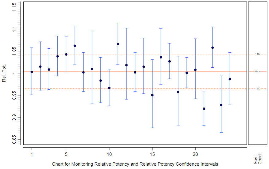
The first chart plots the parameters as points and bars.Figure 1. Visualizing aggregated parameters as points and bars
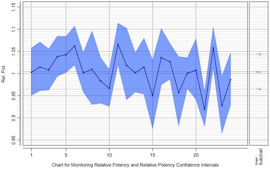
The second chart plots the parameters as lines and area.Figure 2. Visualizing aggregated parameters as lines and an area
Procedure
To define the charts:
In the Content editor of your target document, go to
Charts.
Use the Creatable elements pane to create one more
Chart element.